MIRADA 8ª Edição
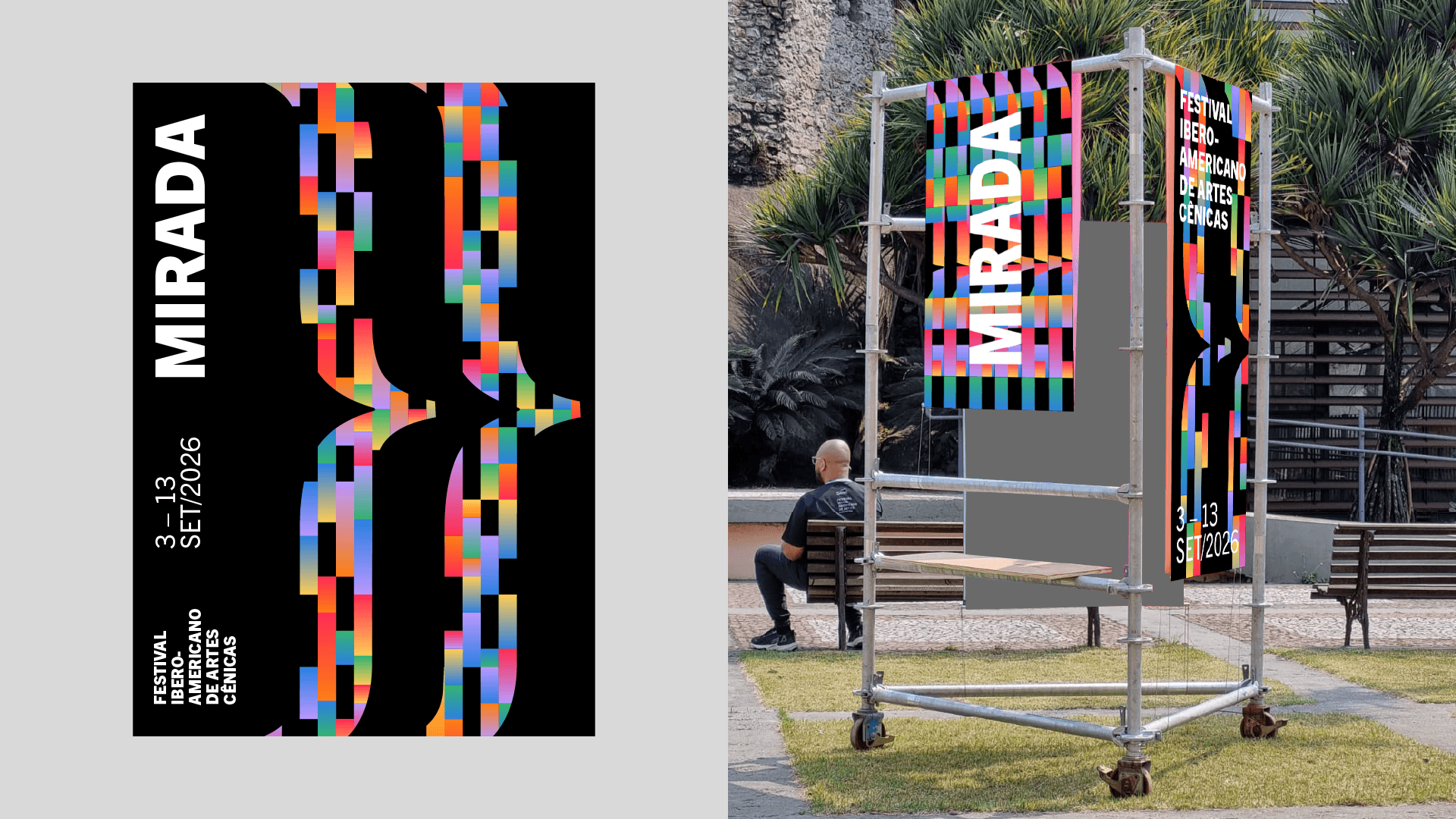
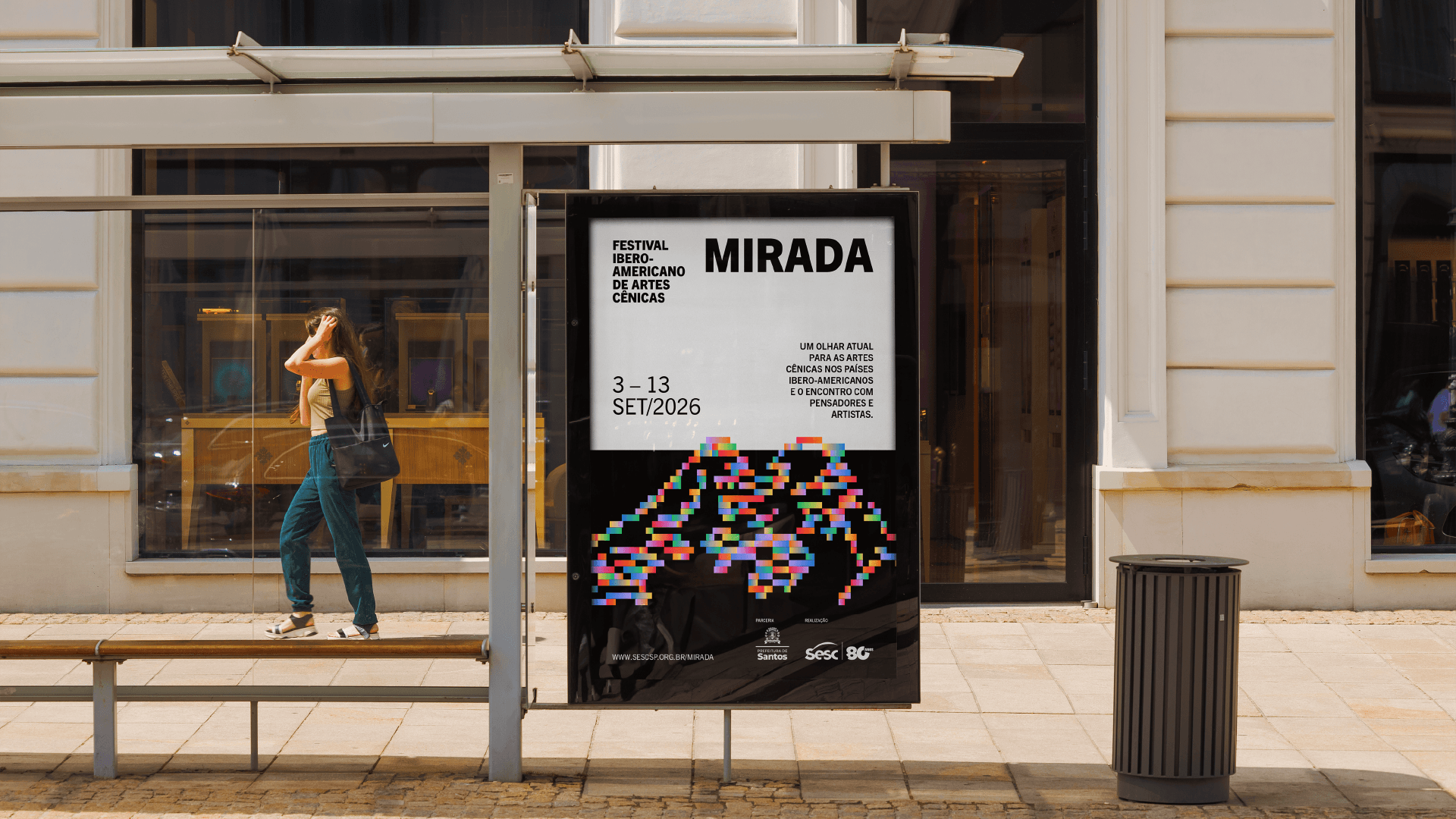
A identidade da 8ª edição do MIRADA nasce do encontro entre linhas, tramas e território. A proposta foi criar uma linguagem que traduzisse a diversidade do festival sem tentar representar cada cultura de forma literal.
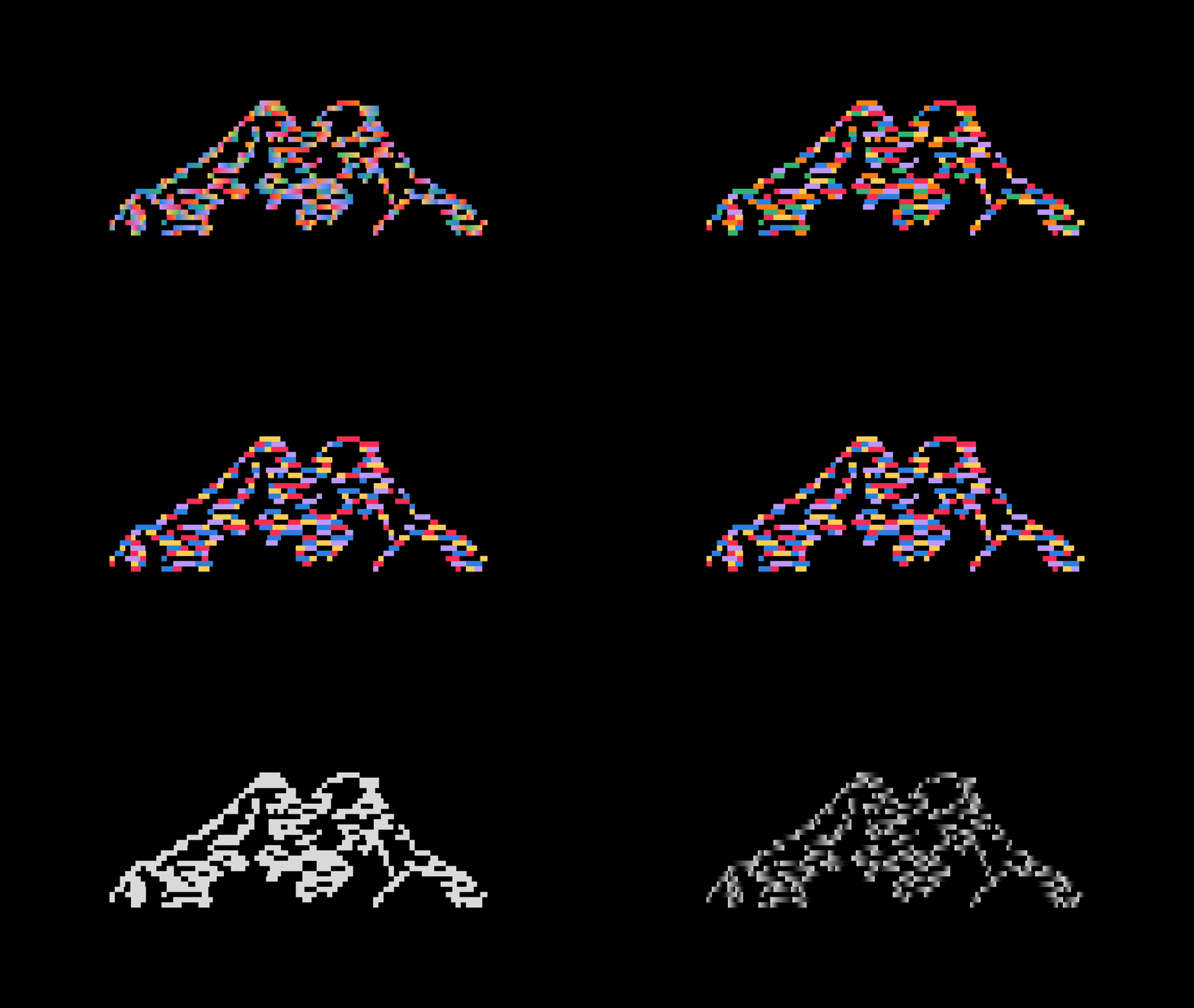
As linhas são o ponto de partida do sistema. Elas se cruzam, se sobrepõem e criam diferentes percursos, formando tramas que fazem referência aos encontros entre artistas, obras e territórios que acontecem no festival. Esse princípio também orienta os layouts, que combinam diferentes direções, escalas e densidades para criar composições vivas e em constante movimento. As tramas também se expandem para construir paisagens, tendo as montanhas andinas como referência. O Monte Chimborazo, no Equador, ganha destaque como inspiração visual e simbólica para representar território. Formadas por camadas, linhas e diferentes cores, as montanhas aparecem como uma metáfora para um território compartilhado, construído a partir de trocas, encontros e atravessamentos.
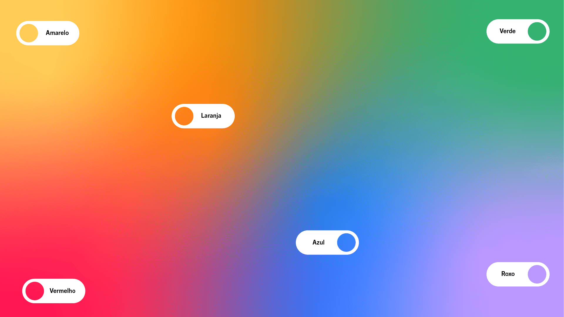
A paleta de cores amplia essa ideia de diversidade. Cores vibrantes aparecem em combinações variadas, criando contraste e dando diferentes possibilidades ao sistema visual. Referências como a Wiphala, os tecidos de Otavalo e a Chakana também entram no projeto, não como reproduções, mas como pontos de partida para construir novas formas e padrões.
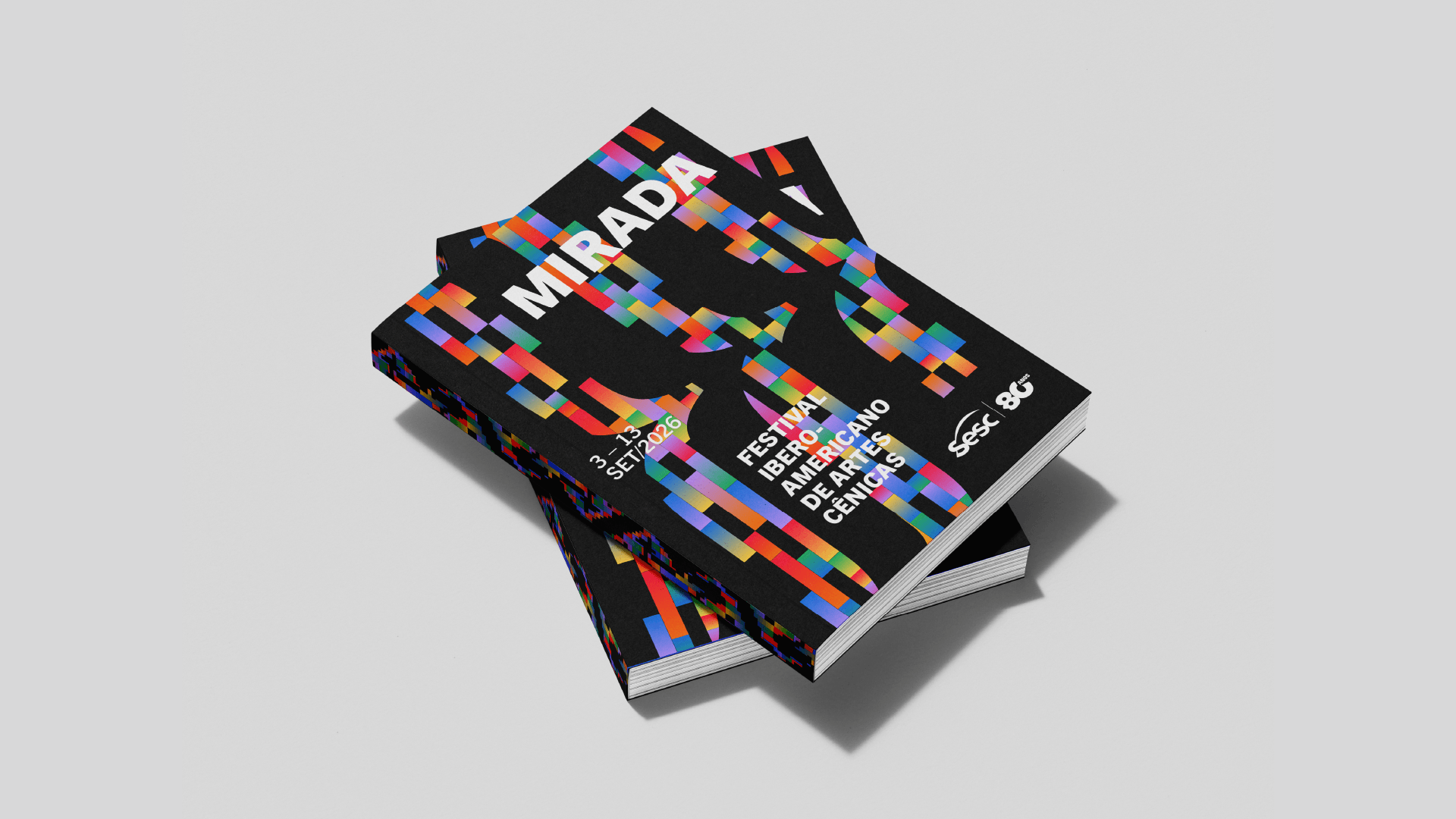
Tudo isso cria um sistema visual que se adapta a diferentes peças e conteúdos sem perder sua unidade, construído a partir de conexões, encontros e sobreposições, assim como o próprio MIRADA.
[EN]
The visual identity for the 8th edition of MIRADA is built around the intersection of lines, patterns, and territory. The proposal was to create a visual language that could translate the festival’s diversity without attempting to represent each culture literally.
Lines are the starting point of the visual system. They cross, overlap, and create different paths, forming patterns that reference the encounters between artists, works, and territories that take place throughout the festival. This principle also guides the layouts, which combine different directions, scales, and densities to create dynamic compositions in constant movement. The patterns also expand to build landscapes, drawing inspiration from the Andean mountains. Mount Chimborazo, in Ecuador, becomes a visual and symbolic reference for the idea of territory. Formed by layers, lines, and different colors, the mountains become a metaphor for a shared territory, shaped by exchanges, encounters, and intersections.
The color palette reinforces this idea of diversity. Vibrant colors are combined in different ways, creating contrast and allowing for multiple possibilities within the visual system. References such as the Wiphala, Otavalo textiles, and the Chakana also inform the project — not as direct reproductions, but as starting points for creating new forms and patterns.
Together, these elements create a visual system that adapts to different pieces and types of content without losing its unity — a system built on connections, encounters, and overlaps, much like MIRADA itself.
CRÉDITOS / CREDITS
CREATIVE DIRECTION: MARIBÊ
GRAPHIC DESIGN: JOANA ARAÚJO
PROJECT MANAGEMENT: JULIANA CAMPOS
STUDIO: STUDIO LOMBRA