Moraes Musical Moreira
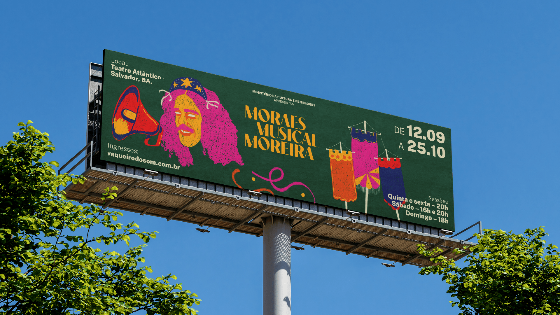
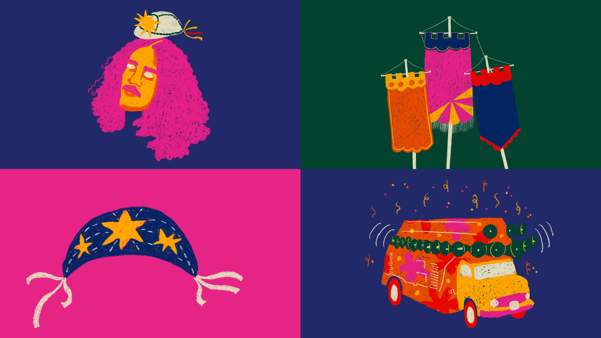
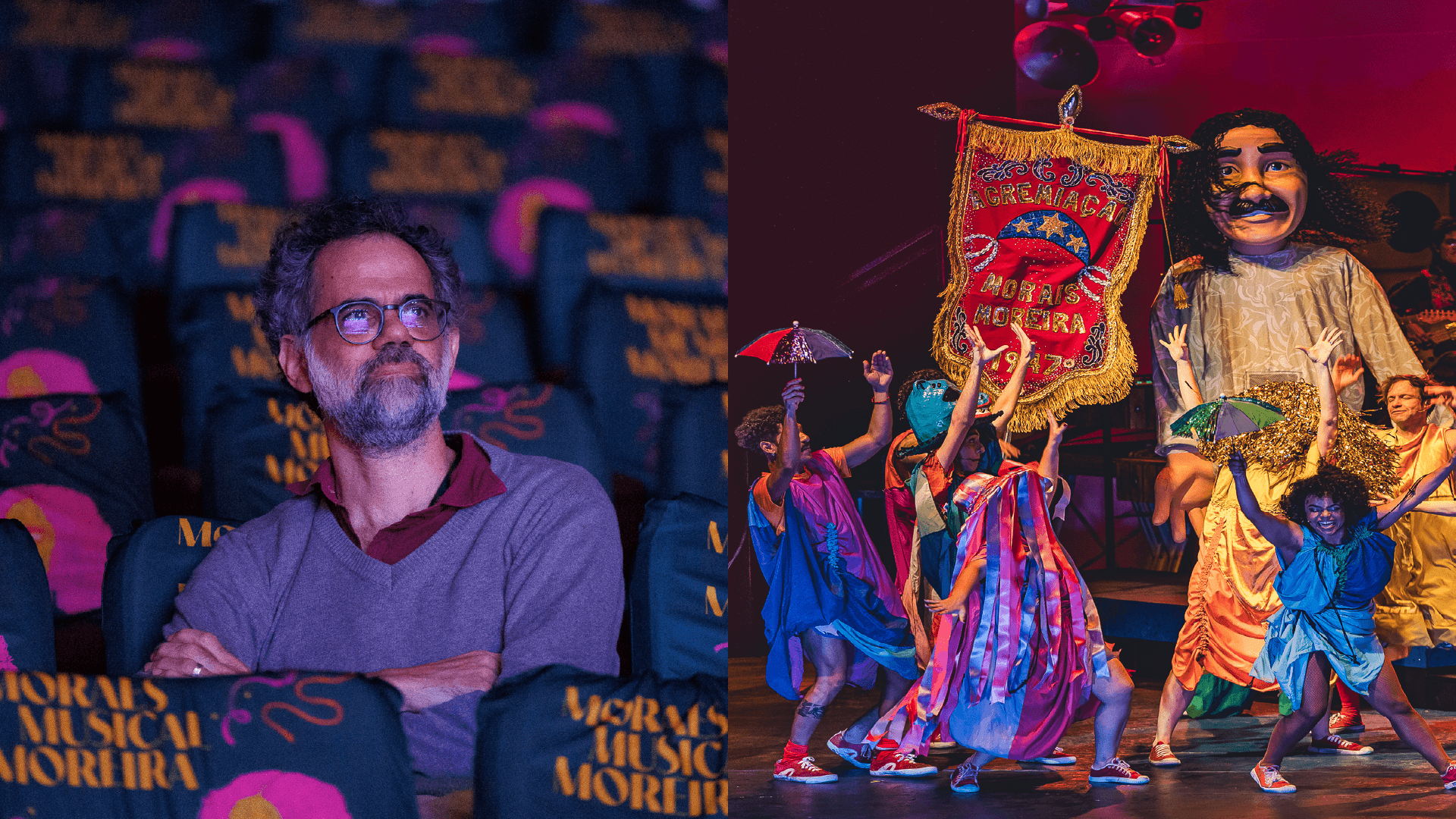
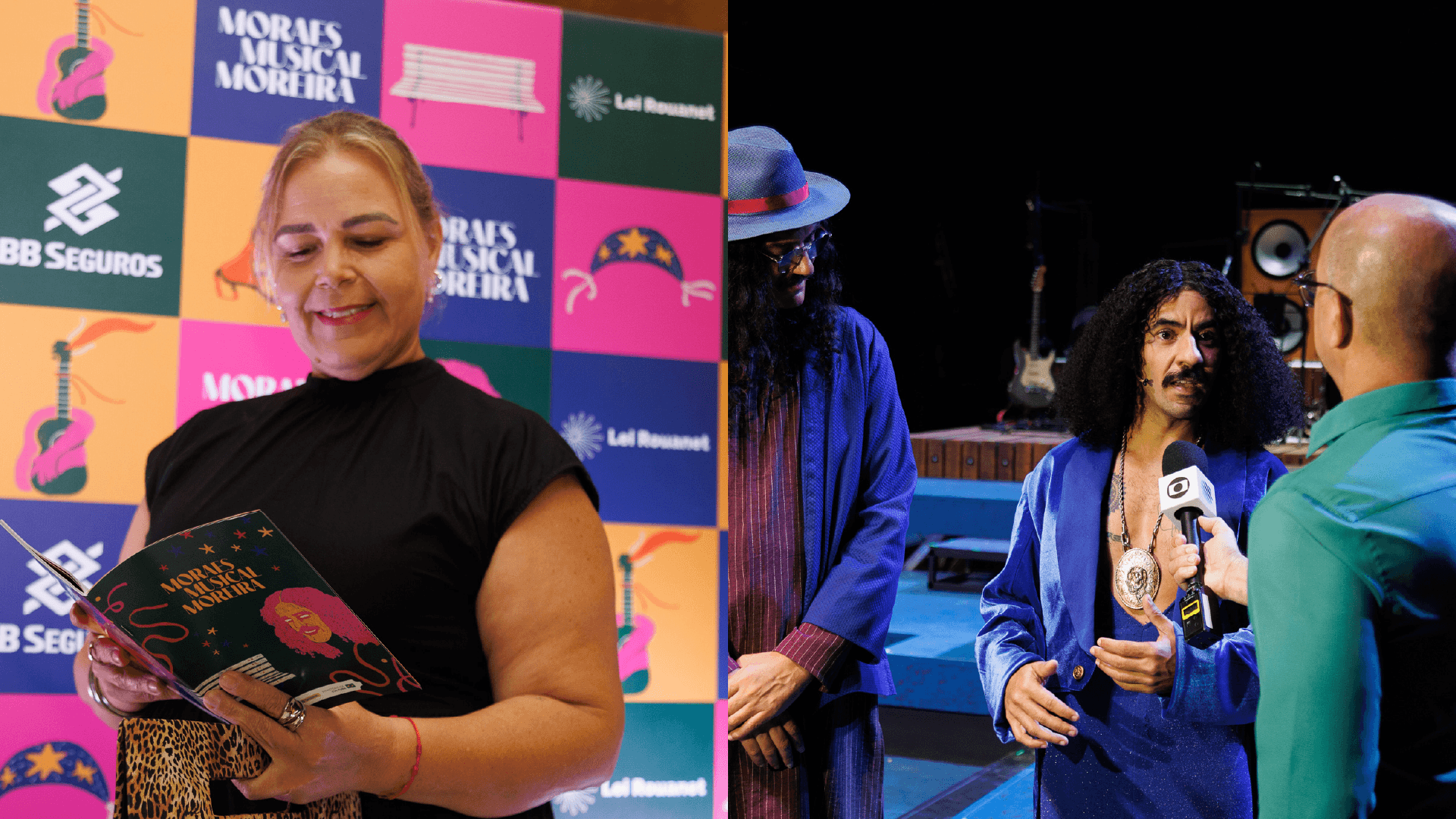
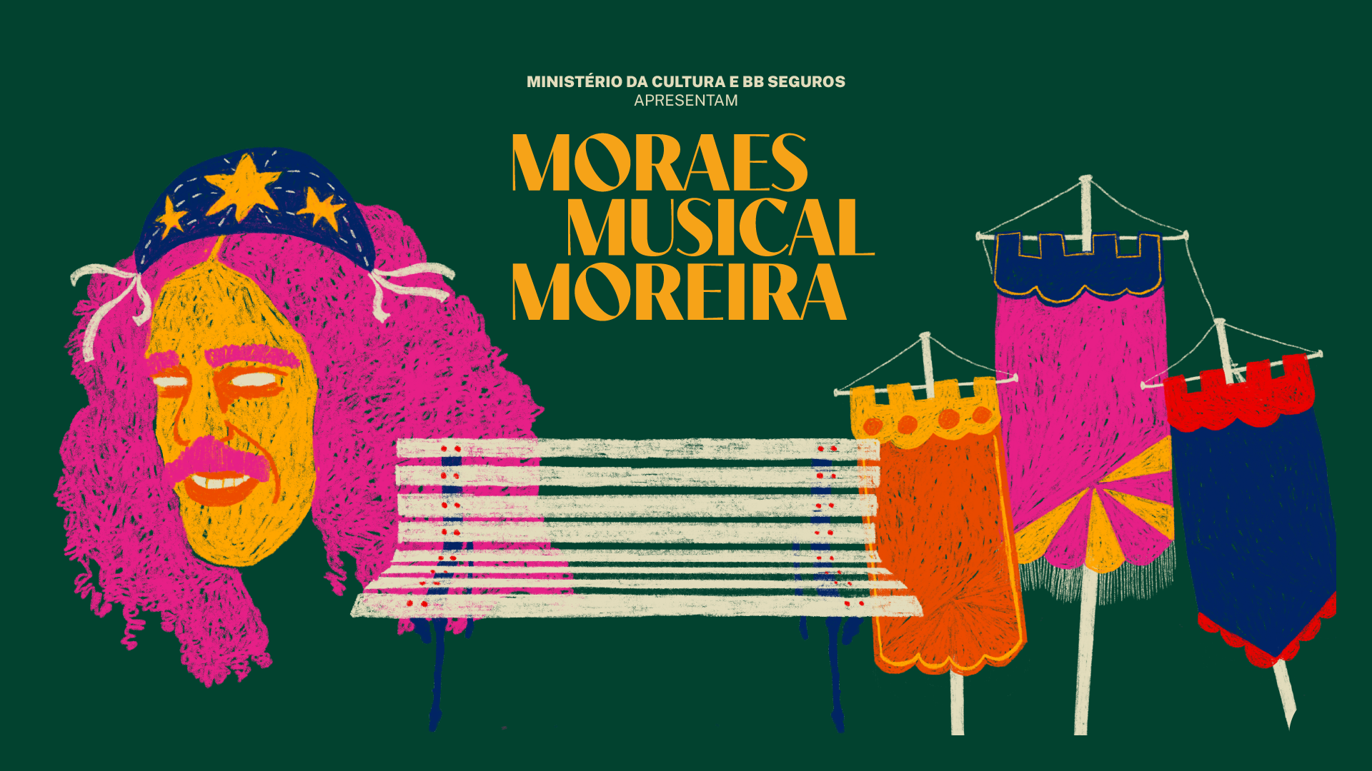
Em 2026, assinamos a marca e a identidade visual do musical "Moraes Musical Moreira — O Vaqueiro do Som", espetáculo que celebra a vida, obra e pensamento de um dos maiores nomes da música brasileira. A construção visual parte de elementos marcantes da trajetória do artista — o rádio, a praça, o trio elétrico — e de sua relação profunda com as manifestações populares brasileiras, como o Carnaval e o São João. Estandartes, tradicionalmente presentes em cortejos e festas populares, aparecem como signo de identidade e pertencimento, reforçando o caráter coletivo da obra de Moraes e a ideia de encontro nas ruas. Por escolha artística, a figura do artista é representada sem pupilas, um recurso que confere um aspecto simbólico e atemporal, sugerindo que sua presença ultrapassa o indivíduo e se consolida como entidade cultural.
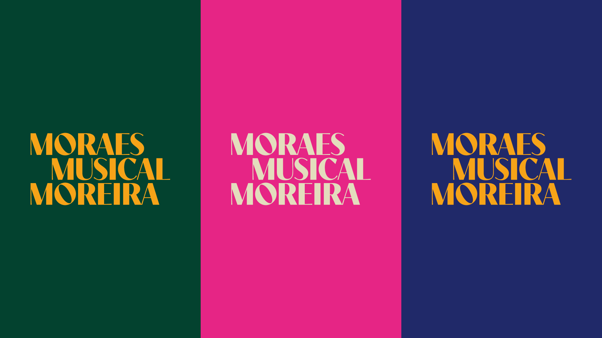
A paleta de cores — rosa, vermelho, laranja e amarelo em contraste com azul e verde profundos — evoca a energia e o calor da festa popular brasileira. No logotipo, letras de eixo levemente inclinado e uma diagramação que rompe com o alinhamento rígido sugerem ritmo e musicalidade, enquanto um degradê cromático confere profundidade à composição.
[EN]
In 2026, we signed the brand and visual identity for the musical "Moraes Musical Moreira — O Vaqueiro do Som," a stage production celebrating the life, work, and legacy of one of Brazilian music's greatest names. The visual construction draws on defining elements of the artist's career — the radio, the town square, the trio elétrico — and his deep connection to Brazilian popular celebrations such as Carnival and São João festivities. Estandartes (ceremonial banners), traditionally present in street processions and folk festivals, appear as a symbol of identity and belonging, reinforcing the collective spirit of Moraes' work and the idea of gathering in the streets. As an artistic choice, the artist's figure is portrayed without pupils, a device that lends him a symbolic, timeless quality — suggesting his presence transcends the individual and becomes a cultural entity in its own right. The color palette — pink, red, orange, and yellow set against deep blue and green — evokes the energy and warmth of Brazilian popular festivities. In the logotype, letters with a slightly tilted axis and a layout that breaks from rigid alignment suggest rhythm and musicality, while a color gradient adds depth to the composition.
CRÉDITOS / CREDITS
CREATIVE DIRECTION: MARIBÊ
GRAPHIC DESIGN: JOANA ARAÚJO
PROJECT MANAGEMENT: EVELIN MAYARA; JULIANA CAMPOS
PHOTOS: CAIO LÍRIO
STUDIO: STUDIO LOMBRA